Purbeck Mobility Centre

Brief
A mobility business with the elderly and disabled as the main customer sector.
Traditionally this kind of shop is looked upon as being associated with the medical and healthcare business. The clinical and bland branding reflected this and the client wanted to update it with a contemporary look.
Strategy and thinking
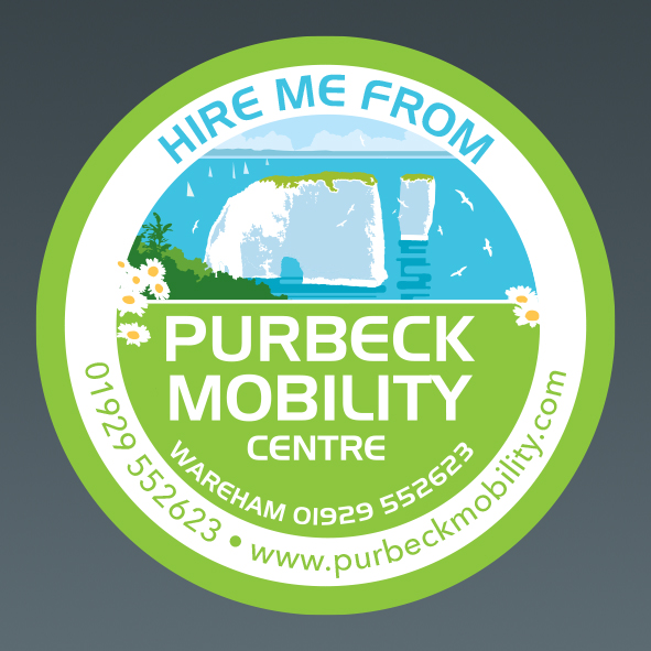
The main focus of the business is to help keep the disabled and elderly mobile and we agreed the new branding should portray a more positive message. The shop is situated in the Isle of Purbeck, a place of outstanding natural beauty, which everyone, including the elderly and disabled should be able to enjoy. Being outdoors has significant benefits and is good for your mental and physical health. It was decided that one of the most iconic views in the area was the famous Old Harry Rocks.
Logo
A logo/brand was created with Old Harry Rocks being its focus. The inclusion of the birds, boats and flowers helps emphasise the freedom of the outdoors, which is intended to inspire customers, despite their disability, to get out and about.

Branding
The design is extended across all other items such as business cards, letterheads and the shop fascia. Posters, flyers and advertisements continue the style which with regular advertising will help create a strong recognisable brand.
The flowers are used in isolation as a very simple version of the logo, as shown here on the staff uniforms. It is also used in black and white on the till receipts.
Also shown here are conceptual livery ideas for the future.
On a more technical side, the logo has been created in a vector style and therefore isn’t resolution based. Resolution based designs can be restrictive when needing to be used in a large format, such as a fascia, or vehicle livery.
If you would like to find out more or discuss a project please get in touch here.


